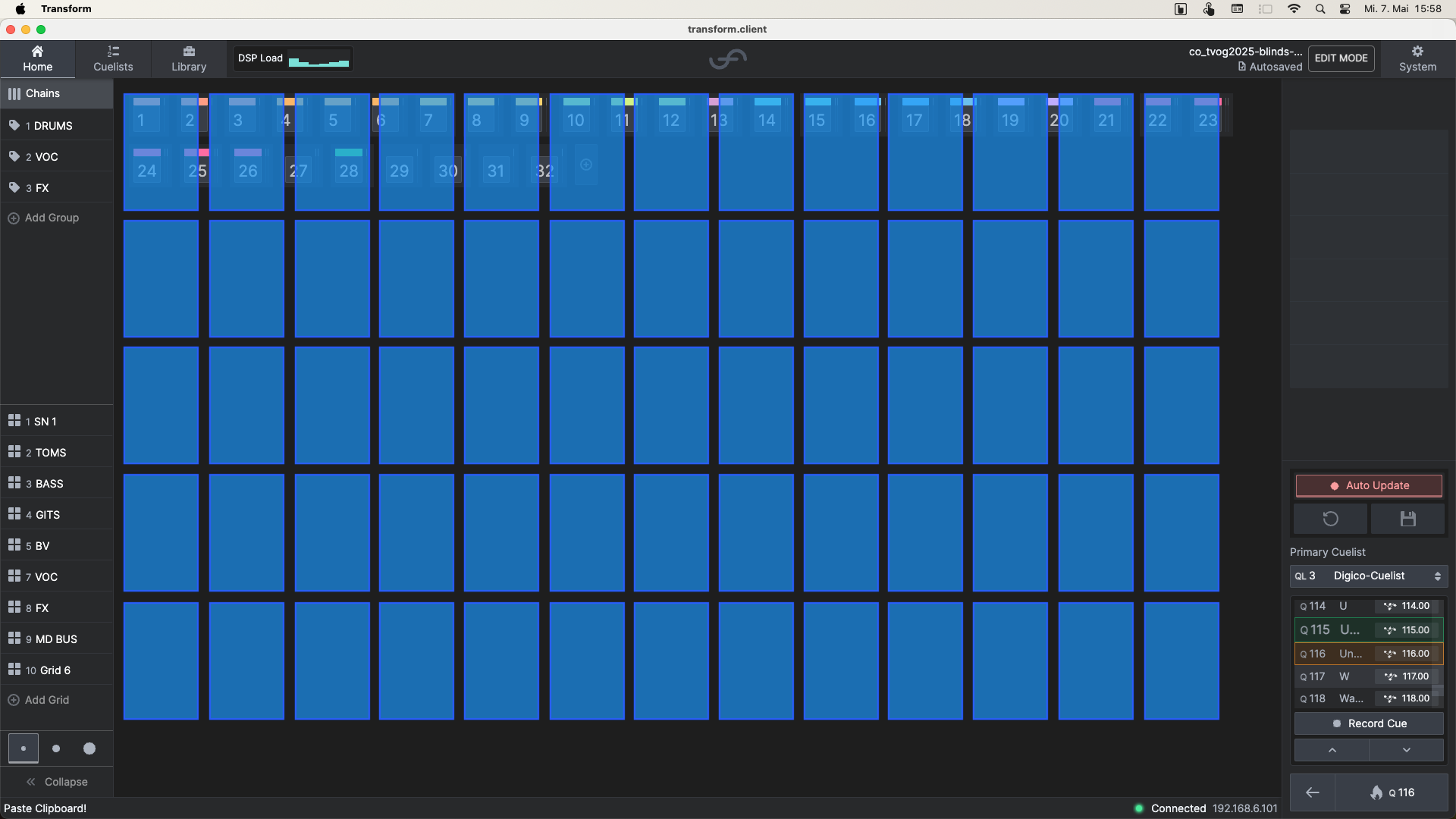
The three view mode buttons in the bottom left offer a nice idea (inspired by previous feedback), but their current implementation is not very helpful.
When the smallest view mode is selected, only the color-coded chain numbers are shown. This requires users to know the numbers by heart in order to select the correct chain. Additionally, a large part of the window remains unused. For example, to display 64 chains, the cell size could be increased significantly.
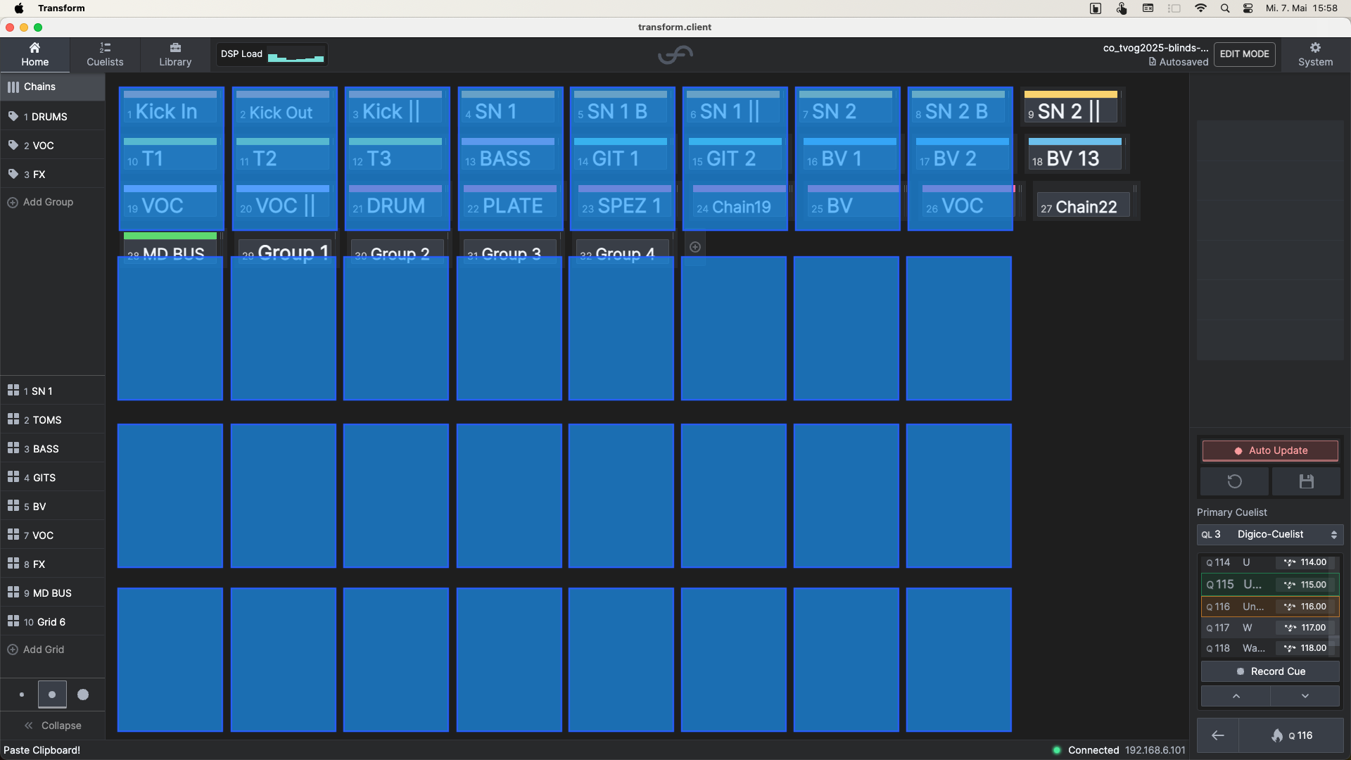
A similar issue occurs with the medium-sized view. Even here, the window space isn’t fully utilized when viewing 64 chains.
A possible improvement would be to scale the layout. In the smallest view, you could show 64 chains with 3–4 plugins each. In the medium view, 32 chains with 5–6 plugins each would still fit well. This would improve readability and usability.