Another request concerns the graphic design of the overview. Basically I really go with the idea of “simple as possible” interface. But, after working with it in real life, some improvements would make my life easier and access to plugins faster.
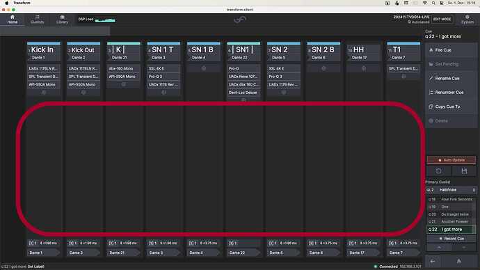
First of all I see a lot of unused space when i have my overview. See pic below:
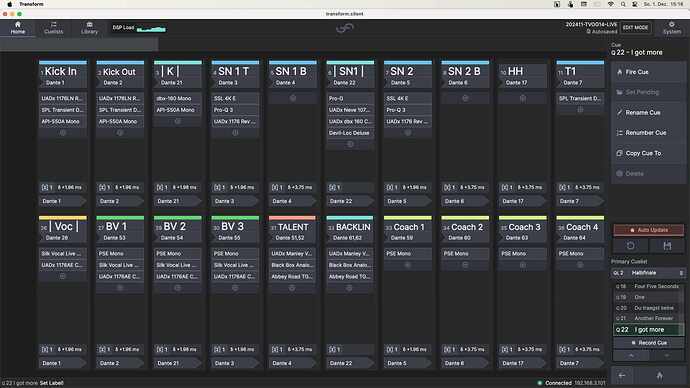
Easiest Way to use it could be a second Row like this:
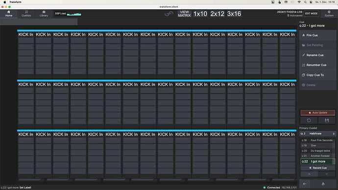
For you surely the harder way but for every user the loveliest could be a selectable option with two parameters: “Rows” (1, 2, or 3) and “Chain Width” (slim and regular). Boxes for nameing, plug in, delay and patching and also metering should adapt responsive. As a result one could have a overview like this:
You could alternatively only offer three presets of a "View Matrix, like “1x10” “2x12” and “3x16” e.g.
Boxes for patching or delay could disappear in smaller sized chains. normaly you only need when setting up the system or a chain…
Best, Chris


